
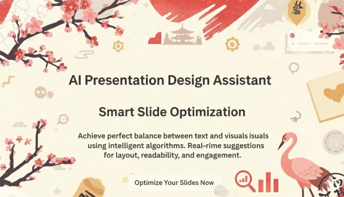
Balancing Text and Visuals – AI Rules For Slide Density
Less is more in the modern era of presentations-but where is the line exactly? Too much text overwhelms the audience, whereas too many visuals make them search for context. Getting the balance just right between text and visuals is one of the most challenging elements of presentation design.
Artificial intelligence helps solve this problem. By analyzing audience behavior, readability metrics, and design patterns, AI-powered tools provide real-time suggestions to optimize slide density that is the ratio of text, visuals, and whitespace. These AI rules ensure that every slide communicates effectively without overloading or underwhelming the viewer.
The Slide Density Problem – Still Growing
With the evolution of digital presentations, slides are no longer static information boards but have become storytelling tools. Research by Microsoft says that the average audience attention span for presentation content has fallen to around eight minutes. That means every second and every word counts.
For years, presentation designers relied on the “6×6 rule” of no more than six lines of text per slide, with six words per line. But today’s audiences are different. They demand visual dynamism, smooth transitions, and clarity-all while retaining substance-managed by modern AI presentation tools.
Many presenters now use intelligent design platforms to create your own AI presentation; it auto-adjusts the text size, spacing, and visual hierarchy to fit the intent of the content. Such systems draw on thousands of successful layouts to suggest the most balanced distribution of visuals and text—making design decisions both faster and more data-driven than ever.
How AI Evaluates and Balances Slide Elements
AI doesn’t just guess at what looks good – it measures. AI-driven presentation platforms analyze a number of variables to determine ideal slide density:
Content Readability
The natural language processing models scan blocks of text to assess reading difficulty and weight of information. If an AI detects too many complex sentences or redundancies, it will suggest editing for brevity or summarizing the content.
For instance, an AI tool could highlight a slide that contains 150 words as too dense to comprehend visually and suggest summarizing it into key bullet points supported by icons or graphics.
Visual Weight and Composition
AI also gauges the spatial balance between the text and imagery. It identifies whether a visual has too much dominance in space or if the text is cramped. Some of these systems use computer vision algorithms that emulate human eye tracking by predicting the first place where the audience will gaze and adjusting element placement for optimal flow.
Engagement Predictions
Advanced AI tools, now integrated into platforms such as Beautiful.ai and Tome, use data from thousands of successful presentations to predict which layout formats keep audiences most engaged. These tools propose slide designs proven to hold the attention of one’s audience, often balancing one concise text block with one meaningful image or chart.
The Ideal Ratio – Finding the “Sweet Spot”
Without a definitive formula universally applicable, the consensus of research continually upholds the 40–60 balance: text to visuals. In other words, a rough approximation of 40% of the space on each slide should be dedicated to text, with 60% going to visuals and whitespace.
The opposite does not mean that each single slide should have both: just an overall balance within an entire deck; maybe some of them are more text-heavy-for example, slides with data analysis-while others rely exclusively on visuals-for example, storytelling slides or product reveal slides.
AI helps find that “sweet spot” by auto-adjusting layouts. For example, when the user pastes a dense paragraph, the system may resize the text automatically, introduce bullet points, and even suggest to them to add a chart or icon to support this material.
Real-World Example – Adobe’s AI Design Intelligence
Adobe, a leading design software company worldwide, incorporates AI into its creative platforms to help in balancing layout and visual hierarchy. In this regard, AI analyzes the composition of a slide using the Adobe Sensei framework and suggests changes for improved clarity and focus.
This allows AI to evaluate an image’s appropriateness in both the placement of the image regarding any message alignment and the level of distraction. Sometimes, it automatically adjusts visuals or recommends a cleaner layout.
Adobe also reported that in internal tests, presentations built with AI design assistance achieved 35% higher audience recall compared to manually formatted decks, proving how machine intelligence can elevate both design quality and audience comprehension through balanced composition.
How AI Encourages Visual Clarity?
1. Optimizing Font Hierarchies
By default, the AI tools make font-size adjustments, line spacing, and hierarchy so that what’s important stands out. For example, if a subtitle seems too small in comparison to visuals, the system would automatically enlarge and reposition them for readability.
2. Adaptive Visual Pairing
AI, enabled by machine learning, can recommend visuals in congruence with textual meaning. For instance, if a slide contains text about “growth trends,” the AI may suggest adding a line chart or an upward arrow icon, instead of some random stock photo. In such cases, contextual alignment between message and imagery is achieved.
3. Whitespace Calibration
Whitespace isn’t wasted space-it’s breathing room for the viewer’s eyes. AI algorithms calculate the optimal whitespace ratio to avoid clutter while maintaining slide symmetry. According to the Nielsen Norman Group, comprehension rates on slides with strategic whitespace are up to 20% higher.
Case Study – Using AI for Pitch Deck Design in Startups
Startups frequently have overcrowded slides, as they try to fit everything on the slides for every minute of display time. According to a 2024 survey by PitchBook, 63% of founders reported that their greatest challenge with presentations is “condensing information without losing key details.”
By using AI-powered presentation platforms, start-ups can now achieve better balance. One tech start-up, for instance, deployed an AI-driven tool to build its pitch deck and managed to reduce slide clutter by 45%. The AI identified redundant text and suggested replacing it with visuals summarizing the same information more effectively. Investors later stated that demo day pitches became much more engaging and easier to understand.
Actionable Tips – Using AI to Balance Text and Visuals
Start with a Clear Message.
Before adding visuals or trimming text, define the main takeaway for each slide. AI does best when it knows the core intent of the content.
Use Templates as Baselines.
Modern AI presentation tools provide data-informed templates optimized for balance. Begin with these frameworks, then adjust as needed.
Leverage AI-Driven Summaries.
Feed long paragraphs into AI summarization features to condense them down to 2–3 key bullet points.
Trust Visual Recommendations.
When AI suggests replacing a paragraph with an infographic or image, consider the data—it’s most likely based on proven engagement metrics.
Review for Human Touch.
AI helps with structure and proportion, but final edits should reflect the presenter’s personality and tone.
The Psychological Edge of Balanced Slides
Studies by the 3M Corporation show that humans process visuals 60,000 times faster than text. However, complex information cannot be delivered with just visuals. Text brings in logic and structure, while visuals evoke emotion and memory. The perfect slide strikes a balance between both, and the audiences can feel and understand the message simultaneously.
AI’s role is to quantify what used to be intuitive: looking at contrast ratios, font legibility, and visual load to ensure that every slide appeals to the two hemispheres in one’s brain-the analytical and the emotional.
This not only enhances the engagement of the audience but also increases retention. Balanced slides allow audiences to absorb information without cognitive fatigue—a critical factor, especially in long presentations or data-heavy content.
Looking Ahead
The future of AI in presentation design will revolve around contextually aware slide density: the ability of the system to automatically change layouts based on audience type or platform. For instance, mobile viewed slides may have fewer visuals and larger text, while the version on the desktop can afford richer visual detail.
Other developers are also testing real-time density adaptation where AI observes audience reactions through eye-tracking or engagement analytics and instantly adjusts either pacing or composition on slides during a presentation. In other words, the balance between text and images in the future of AI will be less about design, and more about data science aimed at optimizing communication efficiency.
Conclusion
Balancing text and visuals has always been part art, part science. With the help of AI, it’s becoming more predictable, measurable, and effective. Tools that understand slide density can now guide users toward cleaner, more engaging presentations that speak to the modern audience’s expectations.
Whether it’s a startup pitch, corporate training, or academic lecture, leveraging AI to manage slide density allows less time to be spent worrying about formatting—and much more on telling a story that truly connects.